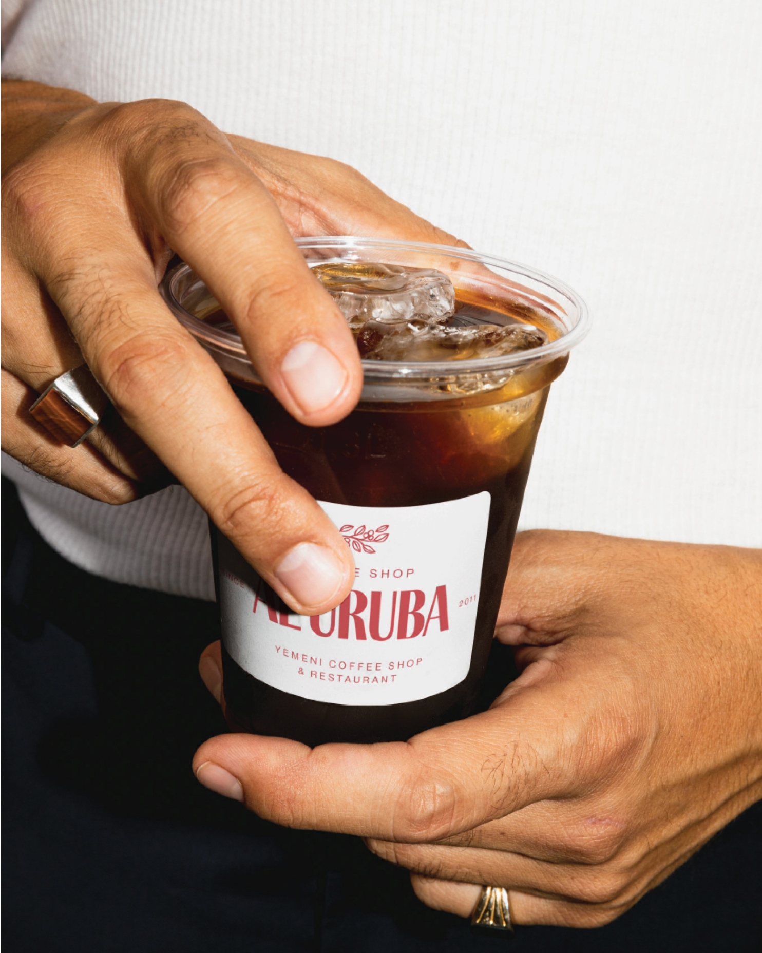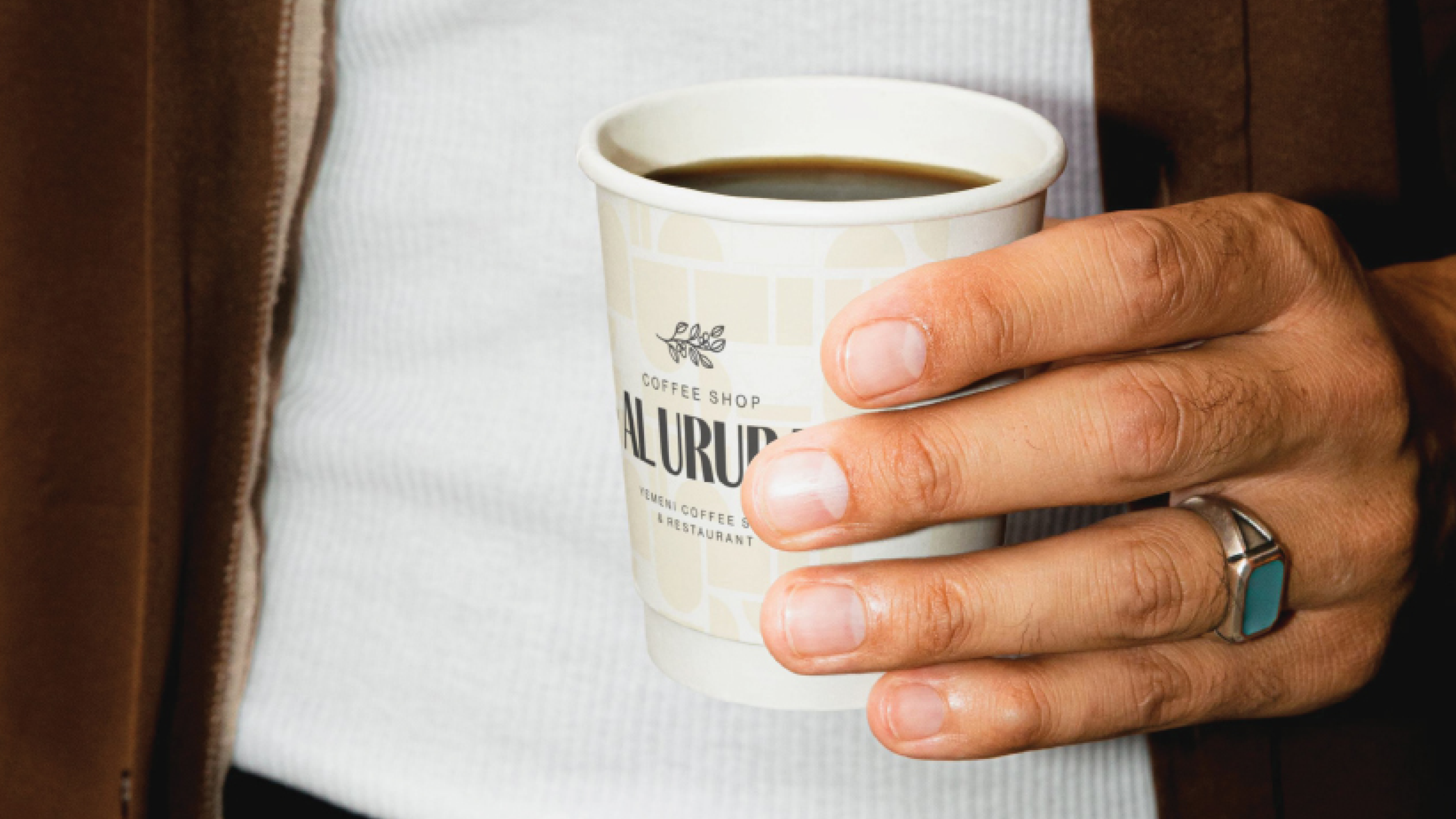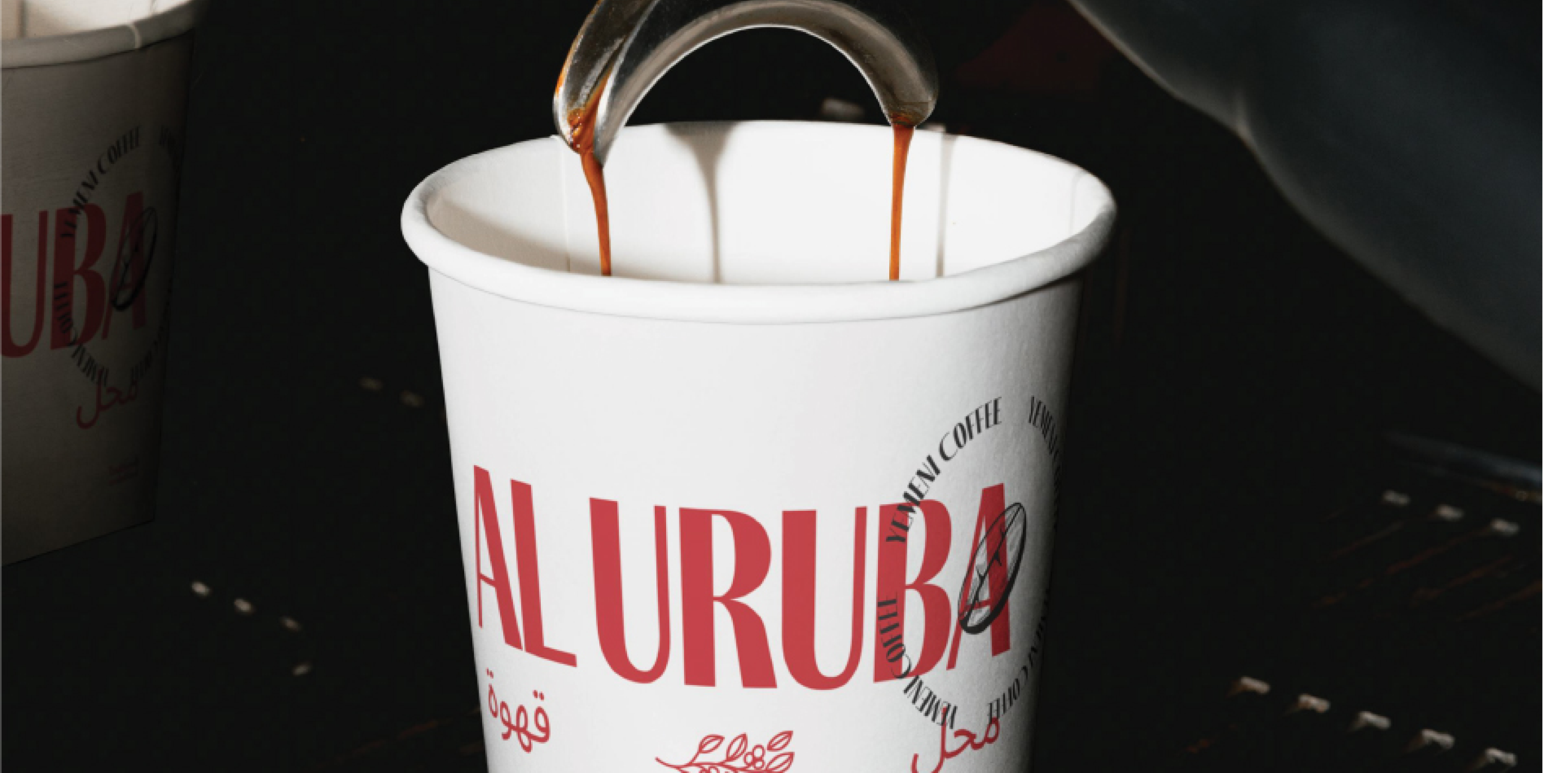
Yemeni-inspired coffee shop offering traditional flavours and cultural warmth.

In 2009, with 3 days' notice, a closed family business and a decision to start again, Al Uruba began.

In 2009, with 3 days' notice, a closed family business and a decision to start again, Al Uruba began.

When new regulations forced the family to close their fragrance business, they turned to something closer to home: Yemeni food, coffee and hospitality. The name carried the memory of a place their late father loved.
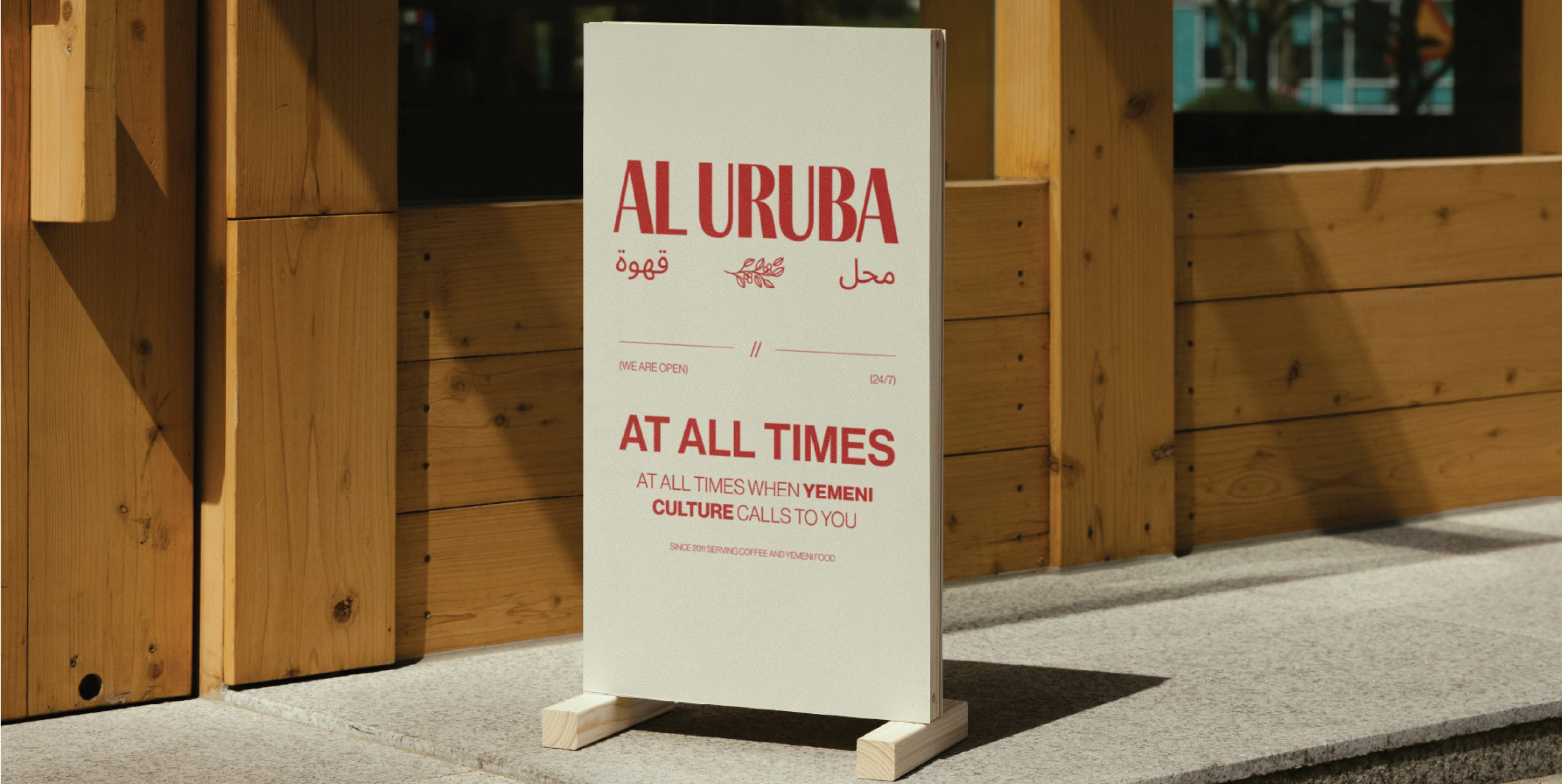
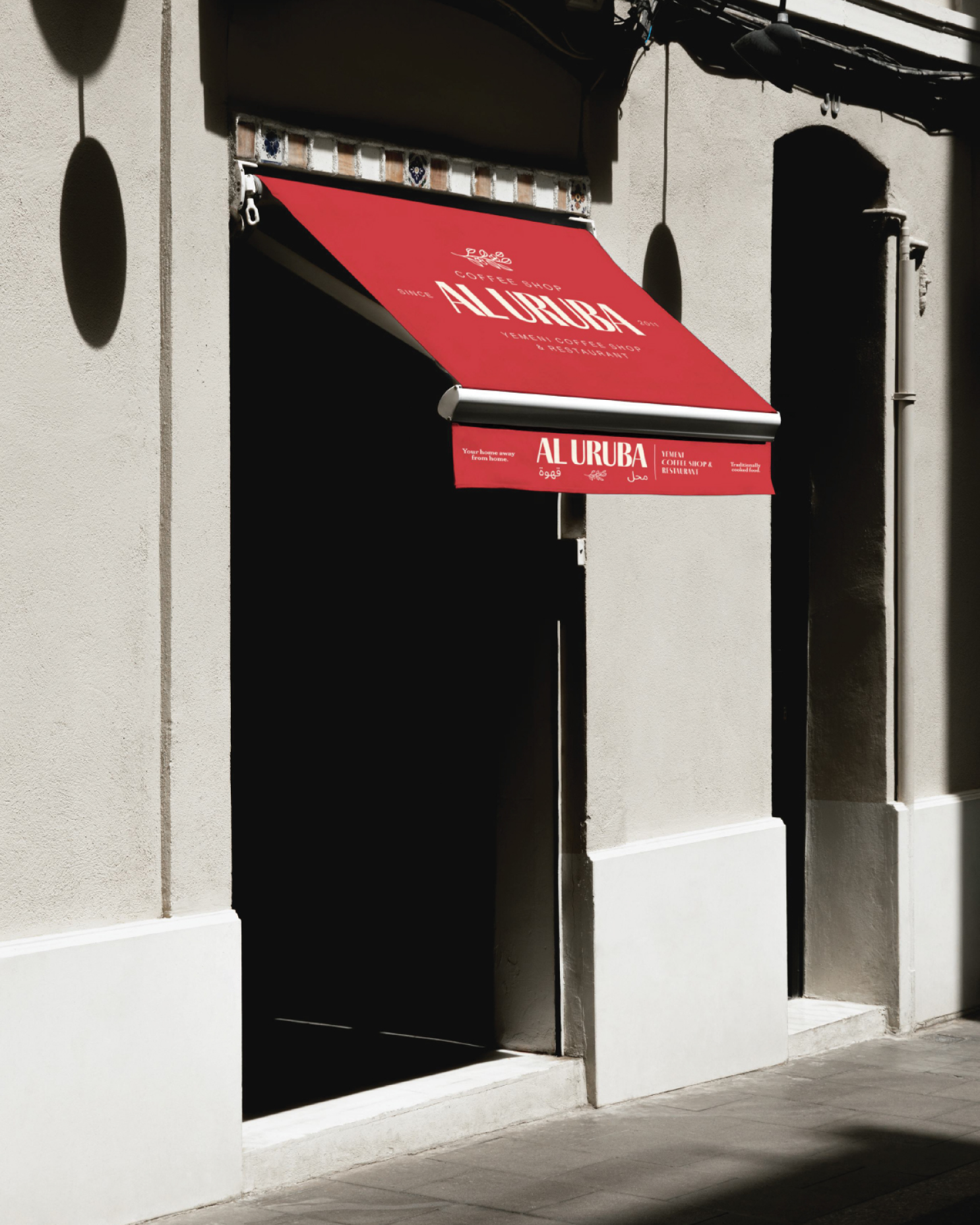
16 years later, 1000’s of loyal customers across 2 flagship locations, it had to grow into a brand that carries its rich history forward.

16 years later, 1000’s of loyal customers across 2 flagship locations, it had to grow into a brand that carries its rich history forward.

The business had grown, but its identity hadn't grown with it. The café, restaurant, menus, packaging and digital presence felt disconnected. Customers couldn't experience them as one brand. It needed to stay warm, accessible and unmistakably Yemeni, while becoming clear and confident enough to welcome a wider audience.

How do you move a café that never closes forward, without losing where it came from?

How do you move a café that never closes forward, without losing where it came from?

The family, their father, Yemeni hospitality and Al Uruba's place in the Birmingham community became the foundation. From there, we explored how that heritage could live within a contemporary British brand without becoming decorative or overly traditional. Typography, colour, architectural patterns and the distinction between café and restaurant were all shaped around that one question. The same thinking carried into the physical and digital experience, so every new application felt part of the same story.

Drawn from Yemeni culture, we created one visual world, rich in patterns that express its culture, its hospitality and the family behind it.

Drawn from Yemeni culture, we created one visual world, rich in patterns that express its culture, its hospitality and the family behind it.

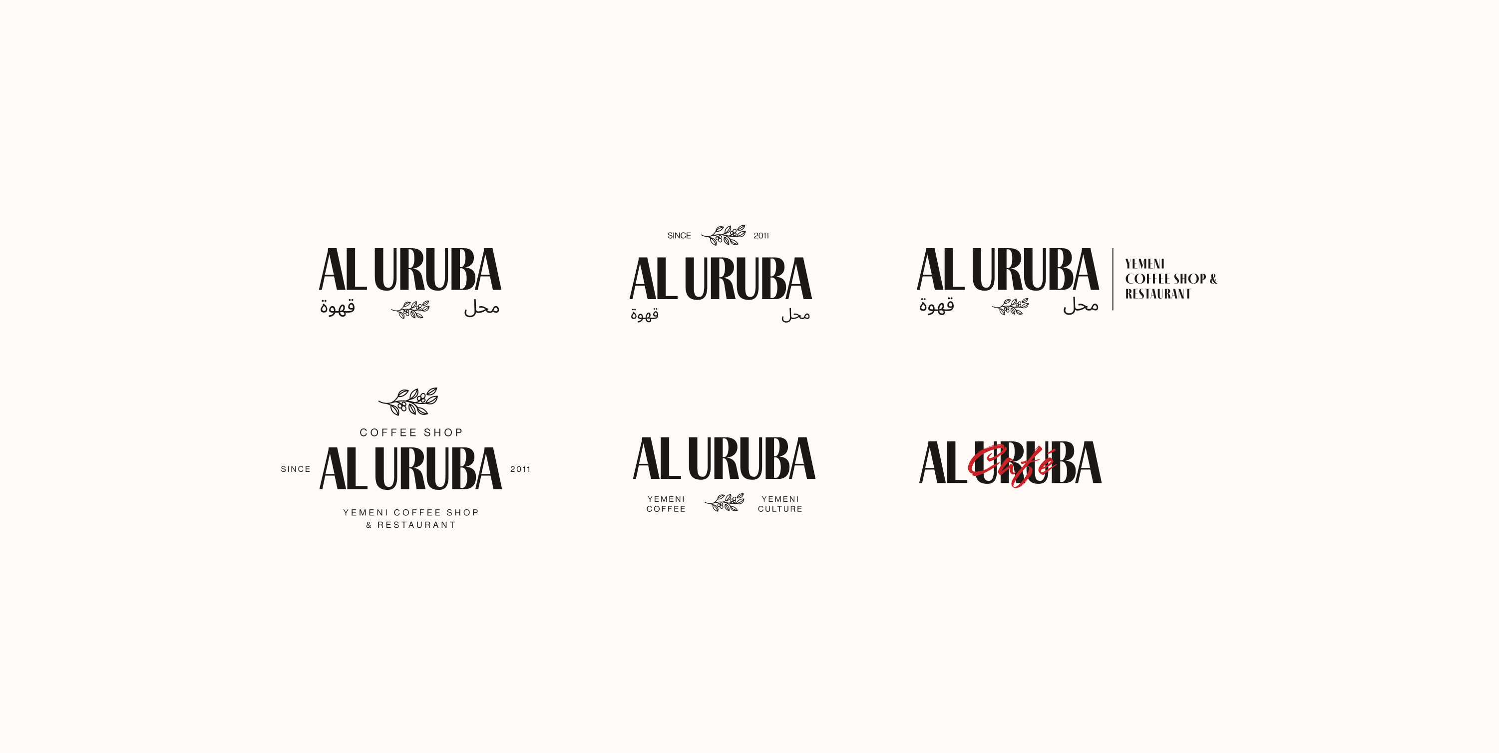
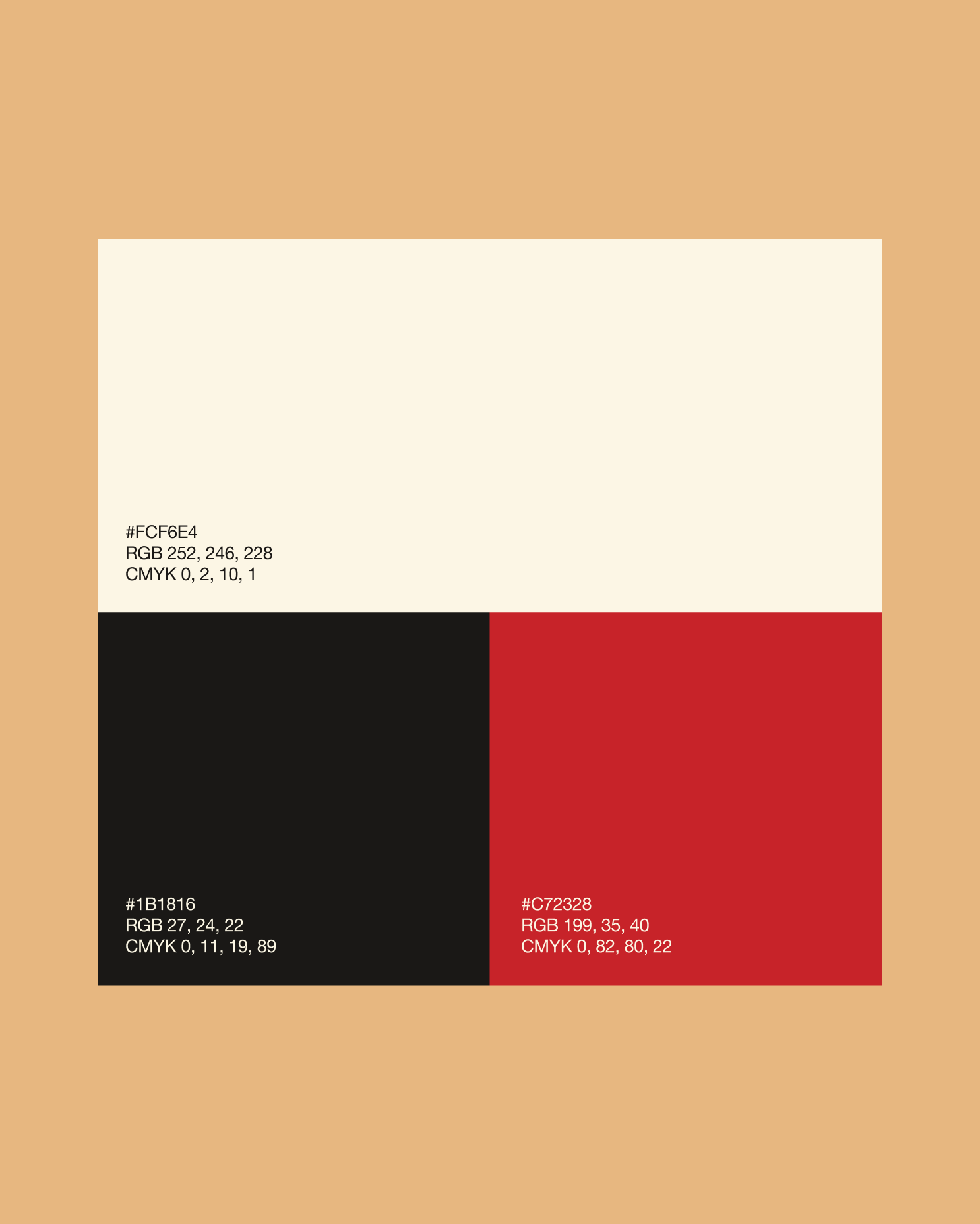
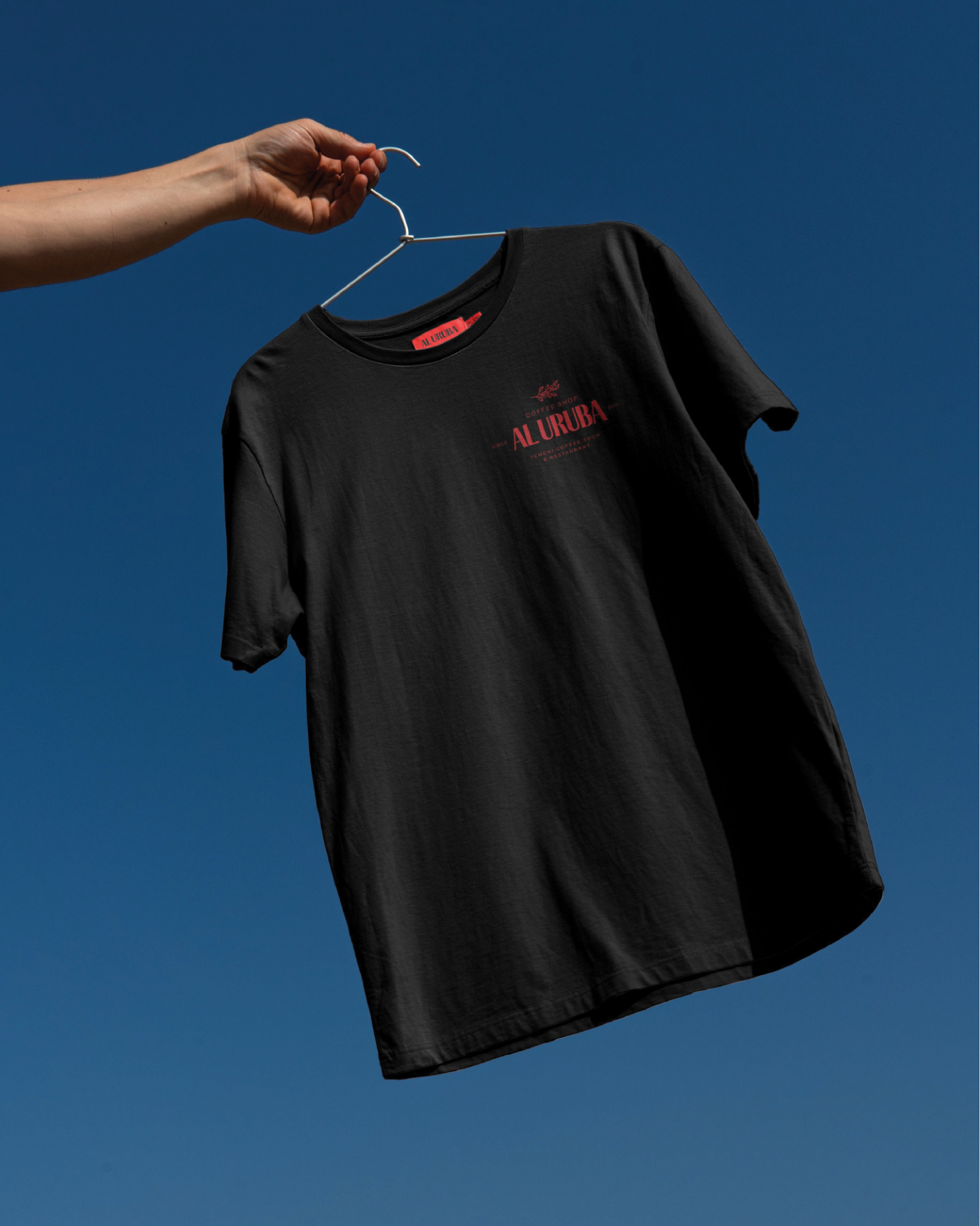
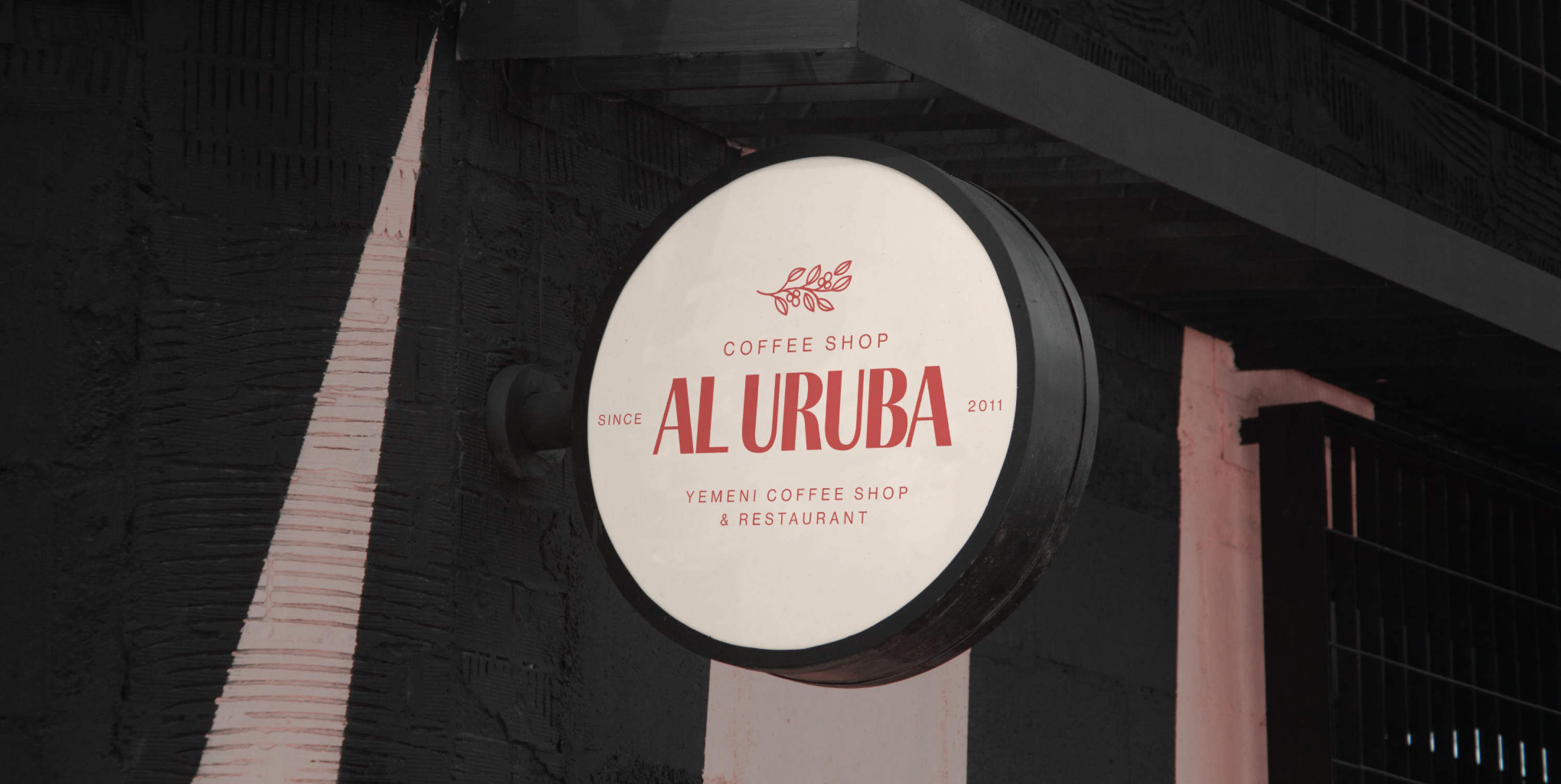
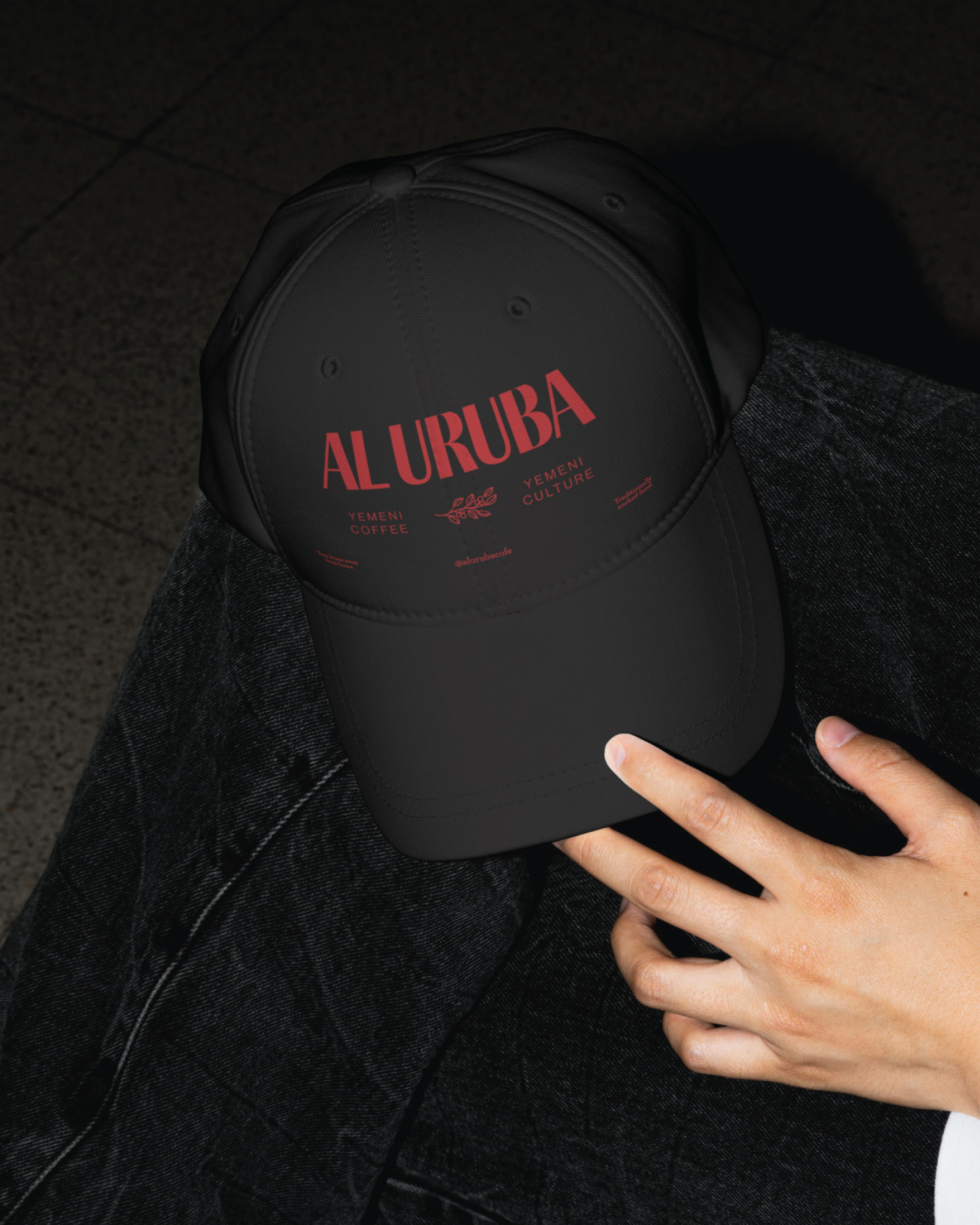
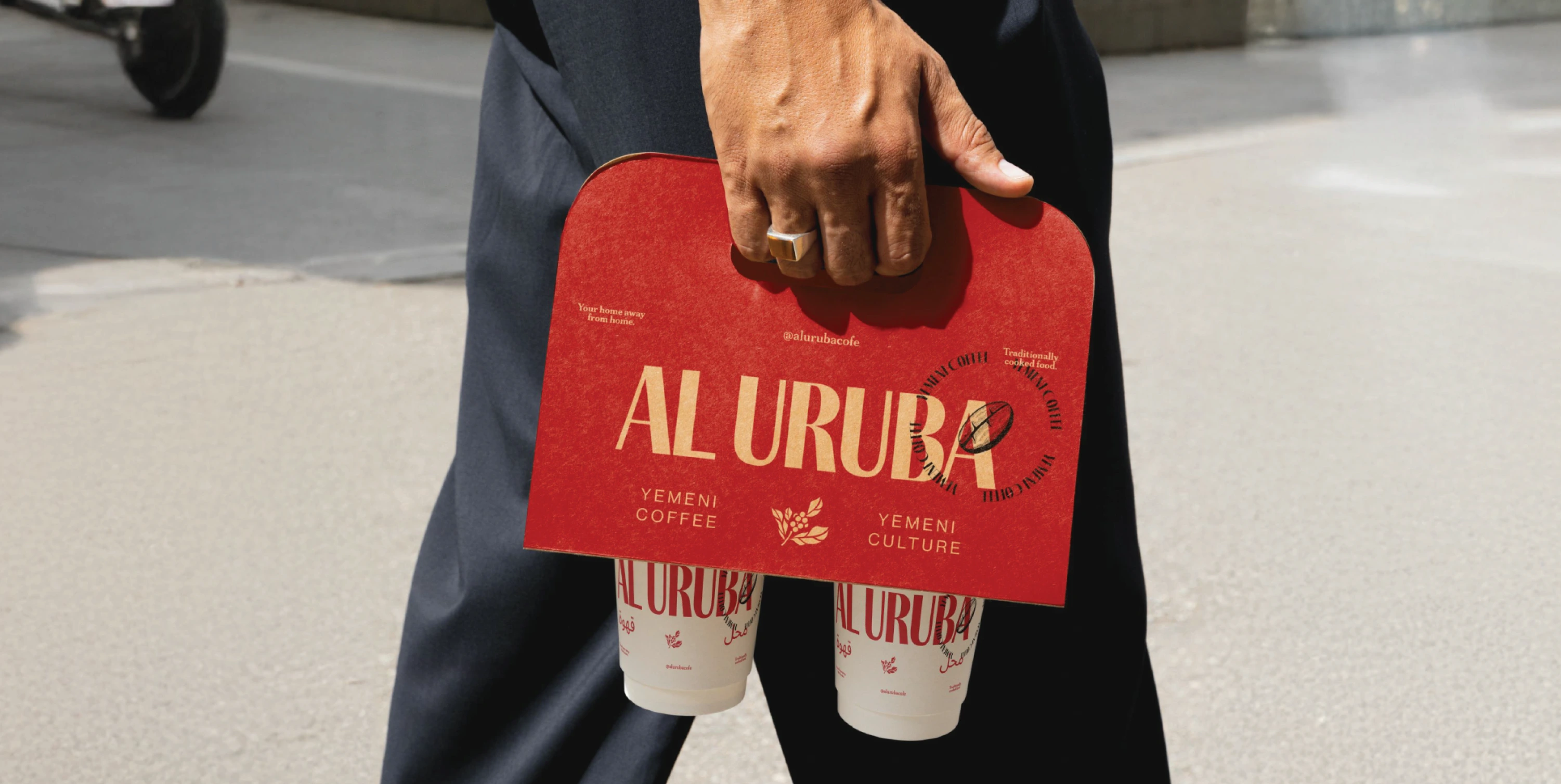
Contemporary typography, colours drawn from Yemeni culture and patterns inspired by traditional architecture now run through the café, website, menus, uniforms and packaging.

The new direction gave that history a more confident way to be seen, and gave the owners an identity that can keep growing with them.

The new direction gave that history a more confident way to be seen, and gave the owners an identity that can keep growing with them.

New and long-standing customers welcomed the change, and the family gained a renewed pride in how their heritage is seen. Al Uruba now feels connected, from the first online search to walking in, ordering and taking something home. What began with three days to start again has become a story spanning more than sixteen years. Our role was not to rewrite that story, but to help Al Uruba tell it properly.

Sector
Food & Hospitality
Services
Start a project

Want to discuss a project?

We'd love to hear about your business and how we can help it be understood.
Get in touch ↗